Tim Harford in The Undercover Economist tells us a story about Tony Dye, Chief Investment Officer at Philips & Drew, who concluded in 1996 that the stock market was overvalued – and effectively transferred £7 billion of his clients’ stock into cash on a savings account.
However, the market continued to climb up and the decision looked ridiculous. In 1999, while Dye had been insisting that the stock market would slump down, Philips & Drew lost more clients that any other fund and got ranked 66th out of 67 (!) competitors.
Not surprisingly, Tony Dye lost his job by March 2000.
But you know what? He was right. Before the company had time to change the strategy after his retirement, the stock market made a dramatic swing down and the unfashionable “value” shares, which Dye had been holding, did far better than anything else. Philips & Drew soared to the top of performance tables, earning its clients the equivalent of more than 28% annual return in a sharply falling market.
Prediction from 1996 was proven right – five years later.
Looking at a bigger picture.
It’s interesting to think about this. If it can take so long to reveal some mistakes, how can we tell for sure that something is a bubble? And how we can avoid making the opposite mistake of undervaluing the stocks?
The Undercover Economist suggests a historical view. He notices that at the peak in 2000 people were easily buying into the stock market because of graphs like this one of S&P 500:
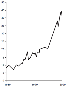
Chances are, after looking at this you would start to regret you hadn’t invested in the early 1980s, and search for the wherewithal to catch up.
But hold on.
The vertical scale of the graph is “price/earnings” ratio and it shows how the price of shares is related to the profits over the previous decade. The ratio of 9 in 1980 means, that investors were paying $90 for shares that had brought $10/year in profits over 1970s. As you see, by 1990s the same $10/year profitability shares would cost around $180. And the delirious ratio of 45 (!) in 2000s translates into $450 for shares which had brought $10/year over the 1990s.
As Tim Harford puts it, “mostly it reflected a view—and an unconscious, unquestioned view—that future profitability would be much better than past profitability, in a way that had never happened before.”
And he suggests another graph:
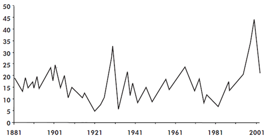
In fact, the first graph is just an extract from the second. Both are based on data of Yale economist Robert Shiller who collected price/earnings ratios back to 1881 and established a prediction that the long-term ratio is always drifting around 16.
So here’s a takeaway for you, dear reader: if a share had brought $10/year in the previous decade, its long-term true cost won’t be much more than $160.
And now, to our own amusement, let’s build a SharpShooter web report with a chart like the one above! ![]()
Part 1 of 2. Preparing a SharpShooter chart.
You can download Shiller’s data in a single .xls file from his website – however it’s too detailed for a blog post, so here we’ll use a smaller set:
  CREATE DATABASE MyTest
  GO
  USE MyTest
  CREATE TABLE ShillerData (
	Year INT NOT NULL,
	Ratio DECIMAL(5,2) NOT NULL
  )
  INSERT INTO ShillerData(Year, Ratio)
  VALUES
	(1881,19),
	(1891,15),
	(1901,19),
	(1911,14),
	(1921,6),
	(1931,16),
	(1941,15),
	(1951,12),
	(1961,13),
	(1971,15),
	(1981,10),
	(1991,16),
	(2001,25)
Now let’s create a SharpShooter report using our famous Powershell script (note that you might need to update your powershell.exe.config, as described here):
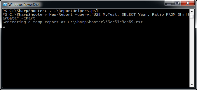
The command above brings up Report Designer, holding a report with a chart control on it, all ready for setting up the chart series.
So we create a new series, setting its type to Line and putting Year and Ratio into XValueMember and YValueMember:
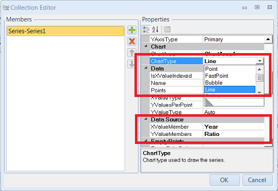
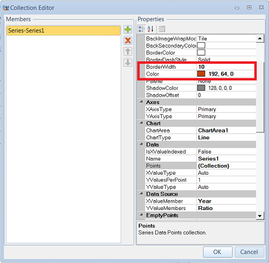
Also, confusingly enough, to change the series’ line width and color, we should use BorderWidth and Color properties:
So, to wrap up – after the script has generated the report for us, all we have to do is to create a series, tell it where to get data for X and Y axis, and (optionally) change the series appearance. Job done.
Now we save the final report under some euphonic name and turn our gaze to Visual Studio: the next step is to make the above report available from an ASP.NET MVC app.
Part 2 of 2. SharpShooter chart in ASP.NET MVC project.
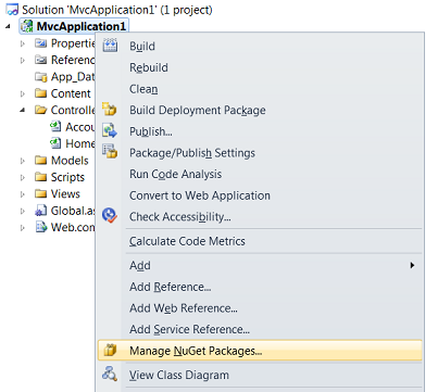
So here we go, creating a new MVC3 project (on the second step, make sure you select “Internet Application” and specify “Razor” as the view engine). Then right click on the project in Solution Explorer and go to the package manager:
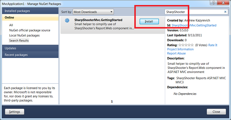
This guy will show a dialog for managing packages – we type “SharpShooter” into the search box, and when SharpShooterMvc.GettingStarted pops up – install it:
The package (more about it here) would setup all the plumbing necessary for SharpShooter HTML5 Web Viewer – and after that there are only two manual steps left for us.
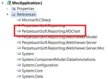
First off, as our report will be using MSChart, we should add the corresponding reference:
Secondly, we need to tell the app to use the report that we created, instead of the fake one created by default. The easiest way to do that is to copy the content of our .rst file and paste it into reportSlot.DocumentStream of FakeReportService.resx, thus overwriting the fake report details.
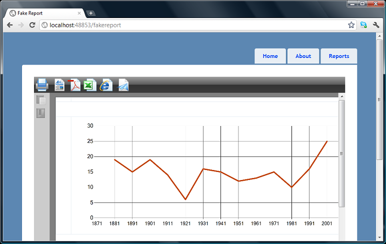
That’s really it. Hit Ctrl+F5, navigate to …/fakereport and enjoy the result:
Summary.
SharpShooter family has just recently been invigorated by a new HTML5 web viewer (which we aptly used in this post) and it’s hard to underestimate this move.
With this new component, any report can be easily implemented or migrated to a web page, where it would be displayed in a fully customizable javascript-based viewer.
Although certain things don’t work as smoothly as they could have been (e.g., take layout issues on the screenshot above) but Reports.Web is definitely a step in the right direction, and learning this component is a good time investment.
Moreover, two free tools would make this time investment even more expedient ![]() :
:
- ReportHelpers.ps1 script to quickly generate report definitions (.rst files) and preview reports without Visual Studio.
- SharpShooterMvc.GettingStarted NuGet package to quickly setup SharpShooter HTML5 report viewer in your ASP.NET MVC3 application
Hi. i wonder if you can help me.
I am trying to bring a chart into the invensys archestra enviroment, i managed to import the chart to a object but no i am struggling to link the data? any help on how to make this work.
Thanks
Charl Strydom
Hi Charl,
I have no clue how your chart object looks like in ArchestrA, and what exactly you’ve done – but if you’d provide some info I’d try to help out.
–Andrew