Logarithmic scale on a chart means that equal steps along its axis represent multiplications by some fixed number (say, ten) rather than additions of a number, as in a “normal” graph.
But don’t get scared off with this tiny bit of math – we’ve got an easy example down here!
A chart indeed may look better with logarithmic scales on the axes, and there are several good reasons for this. In this article we will go though them and see:
- why, and how exactly, logarithmic scale is useful
- how to create a log chart with MSChart
- how to create a log chart with ChartControl
- what’s the difference between SharpShooter native charts and MSChart
Setting up the data.
We will be building a scatter plot of brain/body mass for a few species. Here’s the SQL query to setup the data – we just open up Sql Server Management Studio and run the script:
  CREATE DATABASE MyTest
  GO
  USE MyTest
  GO
  CREATE TABLE BrainBody (
    Id BIGINT NOT NULL IDENTITY(1,1),
    Animal NVARCHAR(100) NOT NULL,
    BrainMassG DECIMAL(8,4) NOT NULL,
    BodyMassKg DECIMAL(8,4) NOT NULL
  )
  INSERT INTO BrainBody (Animal, BodyMassKg, BrainMassG)
  VALUES
	('Mountain beaver', 1.35, 465),
	('Cow', 465, 425),
	('Grey wolf', 36.33, 119.5),
	('Goat', 27.66, 115),
	('Guinea pig', 1.04, 5.5),
	('Asian elephant', 4603, 2547)
Creating a log chart with MSChart.
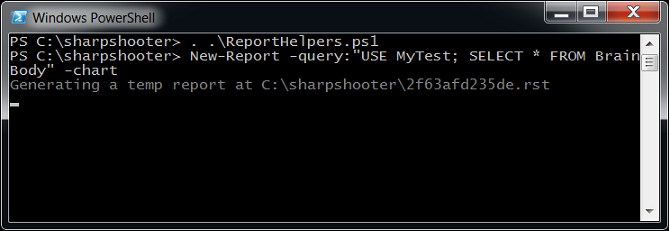
Next, we open up Powershell console and use the open source ReportHelpers to quickly create a report (see an extensive example on using ReportHelpers here and here):
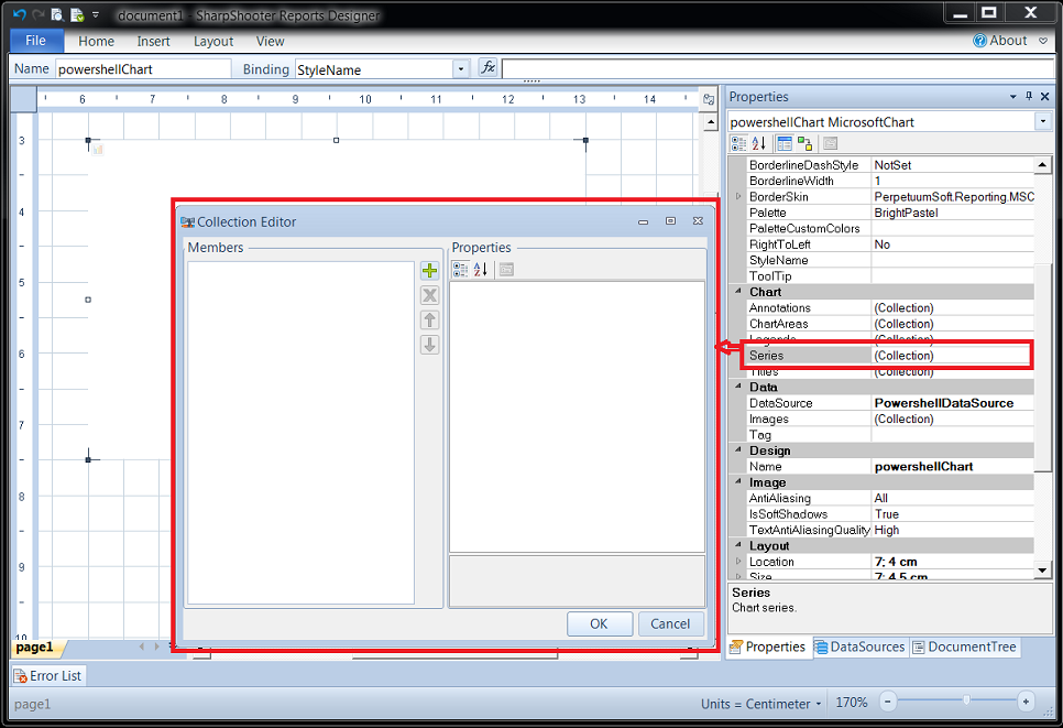
The above script will create a report with an MSChart component already setup on it (you see it as a white box behind the “Collection Editor” dialog on the image below). We just need to tell how our chart should look like – to this end, we create a Series:
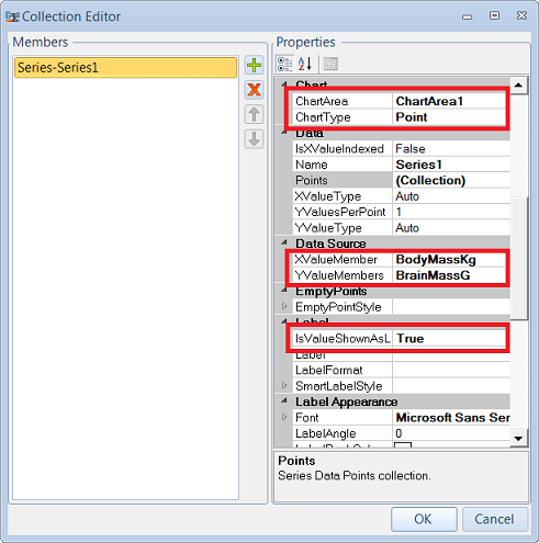
And so we hit the “plus” button on the “Collection Editor” dialog and do the following changes to the newly created Series1:
In short, here is what we’ve just done:
- ChartArea – the chart area where our series would be placed
- ChartType – the type of the cart, we select “Point” because we just want to see the (“body mass”, “brain mass”) as points on the scatter plot
- XValueMember, YValueMember- which value from the data source would be used for the “X” and “Y” axes
- IsValueShownAsLabel – makes the “Y axis” value of the point to be shown as text near the point. Later in this post, when we’d add a SharpShotoer native chart, it will become more clear why we’ve set this one
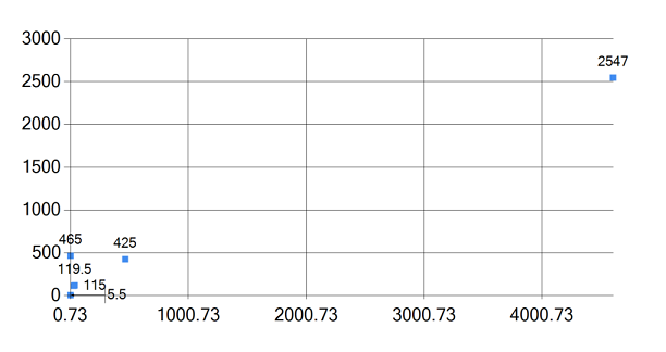
Now we just hit “Preview” and get the result:
Now you immediately see the problem: to fit the elephant on the chart, all other – much smaller – animals had to pack up near the zero. Not good!
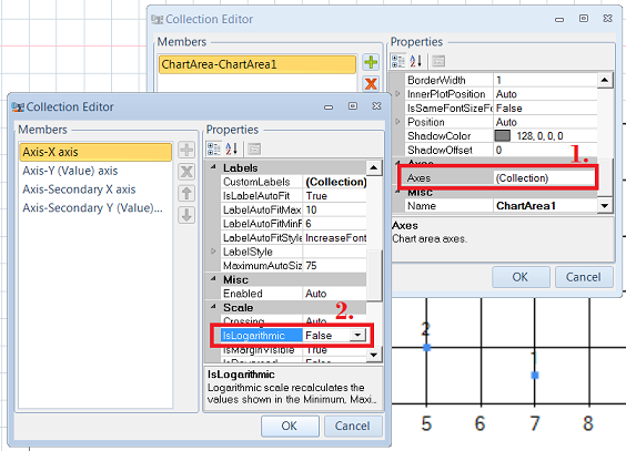
To have a better aligned plot, we resort to logarithmic axes. We select the Chart Area, click on its Axes property and change IsLogarithmic to True on both “X Axis” and “Y Axis”:
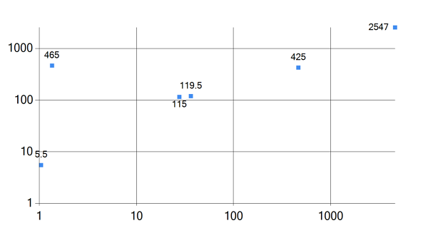
There’s another issue we have to address. After changing the axes to logarithmic, you may see an error message: “Axis object – Negative or zero values cannot be plotted correctly on logarithmic charts”. Indeed, by the very definition of logarithm, a log axis cannot plot non-positive values. To get rid of this error we need to change the Minimum property on both axis from “Auto” to 1 (or any other positive value) – and finally arrive to a much more informative preview:
Now we clearly see the pattern – a straight line of “normal brain/body” ratio – and can easily spot the animals whose ratio stands out. In fact, that’s exactly the line people talk about when they say that human brain is much bigger than it “should” be – but, as we see, mountain beavers also show strong support here ![]()
Creating a log chart with SharpShooter native ChartControl.
We have seen how to create a log chart in SharpShooter using MSChart component. But SharpShooter’s cornucopia of tools does not end up on MSChart – their native charts can be helpful as well – so let’s look at how to create a log chart with the natives!
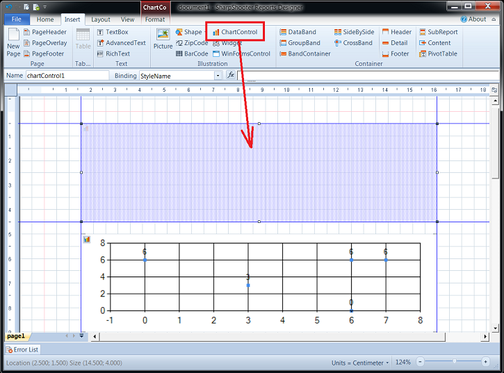
So we slide down our MSChart and drop the ChartControl on the page:
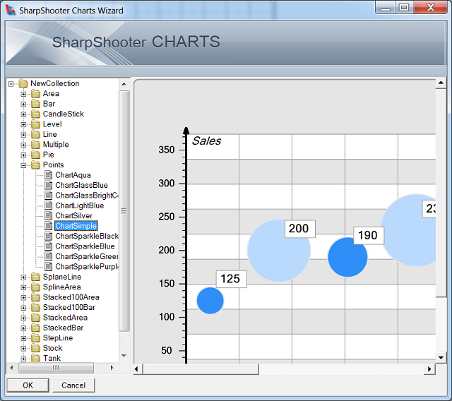
We put our “PowershellDataSource” (generated by the script) into its DataSource property, and then doubleclick on the component to open up the Charts Designer – where the first step is to select a chart from the already existing collection. We need a simple points chart, so select it:
First thing to do next is to save the chart under a different name – you don’t want to change the original one from the SharpShooter Collection!
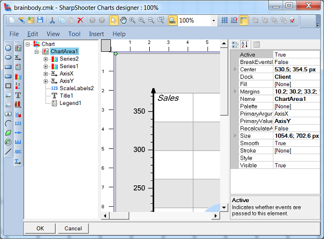
Then, once we’ve saved the chart, we apparently need a cleanup – Series2 is redundant, Legend1 and Title1 can be dropped, ScaleLabels2 needs to be updated, etc:
Assuming that it’s easily done, we won’t spend time on that and would rather move on to the most interesting part: binding our data source to the chart.
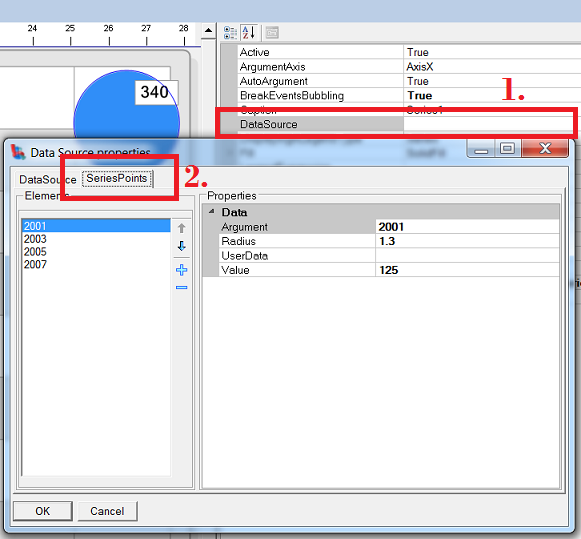
It’s done in DataSource property of the Series – but when you look into it, it seems empty! How come the chart from SharpShooter Collection displays anything given that its data source is empty?!
That’s because it uses so called “series points” – which are set under the Series Points tab:
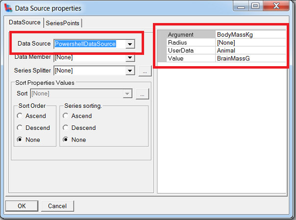
That can be useful for quick prototyping, but our case is different. So we delete the points and instead specify our data source, along with the “X” and “Y” arguments (and something called “user data” – more on that later!), under the Data Source tab:
Note that we could also specify point radius – which can represent the “third dimension” of the data – say, animal’s age or total animal population.
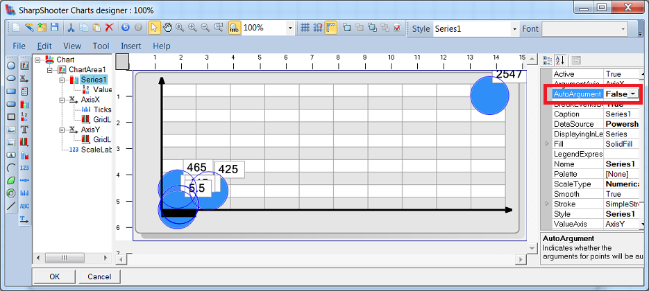
Another important step is to change AutoArgument to False – otherwise the argument points will be automatically assigned, which we by all means want to avoid! (I’m not sure if this auto-assign feature can be useful at all.) Having done so, we face the same problem as originally in MSChart – all animals are jampacked around zero to fit the elephant on the plot:
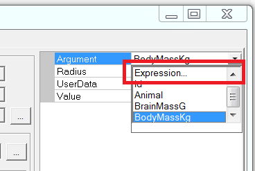
To sort this out, we need logarithmic axes. Here it is slightly more complicated than just setting “IsLogarithmic=true” but indeed possible. We go back to the series Data Source and for both Argument and Value select “Expression” rather than a mere value:
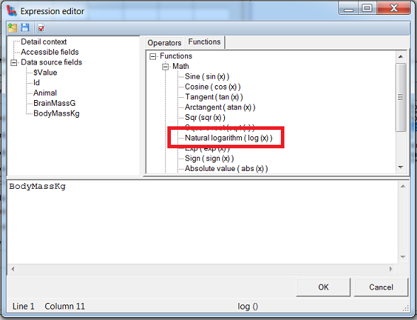
Now we’re presented with Expression Editor, where under “Functions” tab we can find the logarithm function:
Now there’s a small gotcha. They state it’s natural logarithm, so the base is 2.7182… rather than 10 we used in MSChart. This means, in MSChart example each step along the axis meant multiplication by 10 but here in ChartControl the step would mean multiplication by a different value – not good!
To change a natural logarithm (base e) to a common one (base 10), we need to divide by loge(10) therefore our final formulas for “X” and “Y” – using the notation of Expression Editor – will be
- Argument = log(BodyMassKg)/log(10)
- Value = log(BrainMassG)/log(10)
Another interesting option is UserData we entered before – it’s useful for displaying additional information on the chart. Now we can select ValueLabels1 under the series, and put “UserData” into its Formula property – this will display whatever we had put in UserData, as a label for each point. Neat!
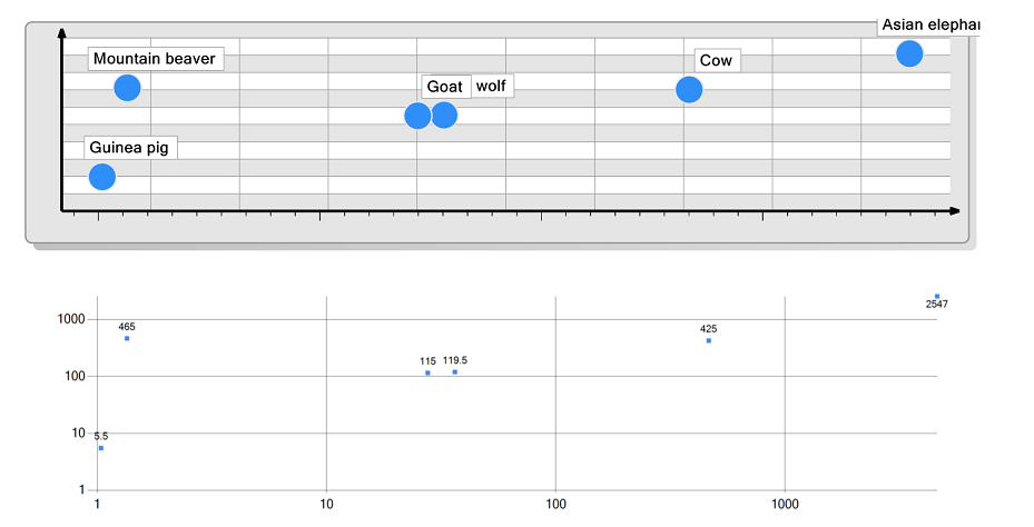
Now, after this long preparation, out charts can be finally seen side-by side:
Summary.
In this article, we went through creating a log chart with both MSChart and ChartControl.
We’ve seen that a log scale can nicely put a beaver and an elephant on the same graph without needing a ten-meters-wide screen. We have also seen that a log chart makes multiplicative judgments easier: we can immediately tell that some species has exactly n times bigger brain than expected – those multiplicative factors are “just there” sitting on the log chart. And, perhaps most importantly, a logarithmic scale puts our scatterpoints along straight lines which makes it easy to spot patterns!
As for tool comparison, we have seen that
- MSChart is perhaps easier to setup, and its properties are more, well, ergonomically aligned. Also, it’s a wide-spread component which can be reused elsewhere – so the knowledge you’ve gained with “SharpShooter MSChart” can be applied elsewhere (and vice versa, having worked with MSChart on other projects you can use known approaches in SharpShooter charts).
- On the other hand, ChartControl with its formulas for arguments, its “user data” option, and its devastatingly huge list of ready-made examples seems to be a more powerful (although indeed more complex as well) tool – especially for quick prototyping and for tasks which involve manipulating data on the client.
And, most importantly, we’ve seen that both tools work great with SharpShooter, and the original task can be perfectly solved. Happy days! ![]()
