This article describes basic SharpShooter Diagrams features. You will see how it is easy-to-use yet powerful and flexible. Let’s begin with the Tools.
Tools
The Tool defines reaction of the component on user actions. It can be changed by updating the DocumentModel.Tool. All standard Tools are the properties of the DocumentModel class. Let’s point out some of them:
For manipulation with a document (DocumentModelBase properties):
- SelectTool
- PanTool
- DynamicZoomTool
- ViewerTool
For objects drawing (DocumentModel properties):
- LineTool
- RectangleTool
- EllipseTool
- TextLabelTool
- StraightConnectTool
- SteppedConnectTool
- RoundedSteppedConnectTool
- CurvedConnectTool
- ArrowTool
- ArrowTool2
- FreeHandTool
Besides, it is possible to create a custom Tool. The best way to do this is to inherit from the ManipulationTool class and override the required methods. Below you can see a sample Tool which brings a special message on a mouse-click where you can see either a shape name we click it or mouse coordinates if we click empty space:
{
public CustomTool(IContainer container) : base(container)
{
}
public override void MouseDown(MouseData data)
{
base.MouseDown(data);
string message = "MouseDown(" + Math.Round(data.Position.X) + ", " + Math.Round(data.Position.Y) + ")";
Element element = HitTest(data.Position) as Element;
if (element != null)
message = element.OutlineName;
MessageBox.Show(message);
}
}
If it is required to add more features or redefine the features of an existing Tool, it is needed to use the DecoratorTool base class which represents a wrapper of the redefined Tool.
GraphLayoutEngine
The GraphLayoutEngine is a special class for automatic layout of elements on a diagram. Each layout type can be applied to a whole document as well as to some part of it. Any layout method has, among others, the IEnumerable argument which defines a list of shapes to which the layout applies. Currently, a list of standard layouts includes:
Graphs layouts
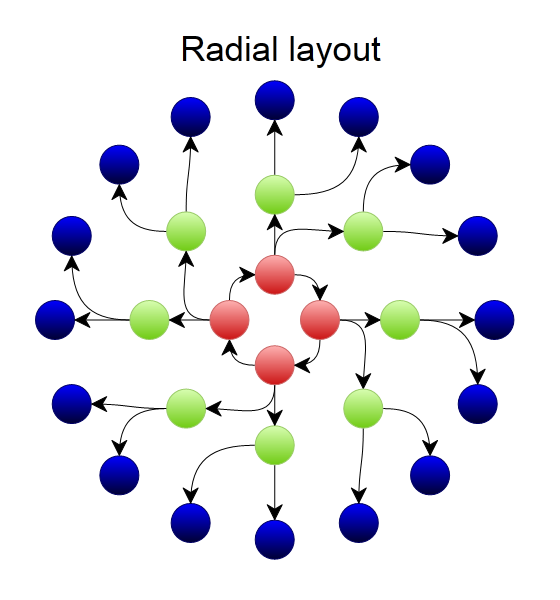
- RadialLayout – elements layout by coaxial circles
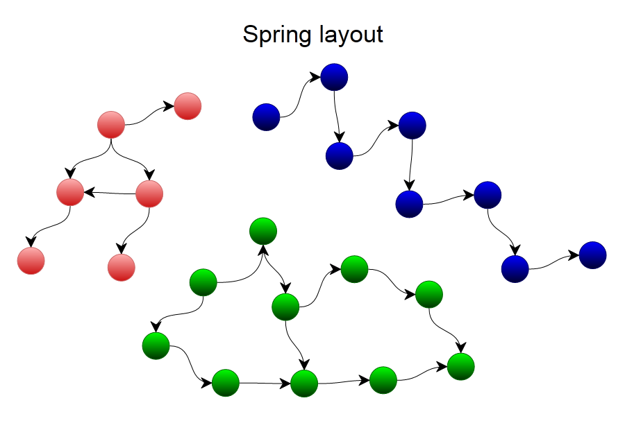
- SpringLayout – elements layout by energy formulas (all elements repulse from one another and the arrows play a role of connecting elements preventing repulsing)
- ShuffleLayout – shuffles the elements
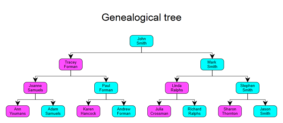
Hierarchical trees layout
- SoftHierarchyLayout – minor correction of a diagram to make it more similar to a tree.
- HardHierarchyLayout – correction of a diagram to create a full-featured tree.
- AlignmentLayout – alignment of the elements, correction of their relative positions.
- CompactTreeLayout – special type of hierarchical layout
Layout of elements
- HorizontalCellLayout – lays elements in several layers
- VerticalCellLayout – lays elements in several columns
Geometric transformations
- RotateTransform – rotates by some angle
- HorizontalFlipTransform – reflects objects by horizontal axis of symmetry
- VerticalFlipTransform – reflects objects by vertical axis of symmetry
Distributional layouts
- HorizontalLeftDistribute, HorizontalRightDistribute, HorizontalCenterDistribute, HorizontalJagDistribute – distribute elements by horizontal line
- VerticalTopDistribute, VerticalBottomDistribute, VerticalCenterDistribute, VerticalJagDistribute – distribute elements by vertical line
Below is an example of layout calling for selected elements of a page:
var container = diagramComponent.DocumentModel.Container;
GraphLayoutEngine.RadialLayout(selection, container);
As a result you can get the following layouts:
Fills
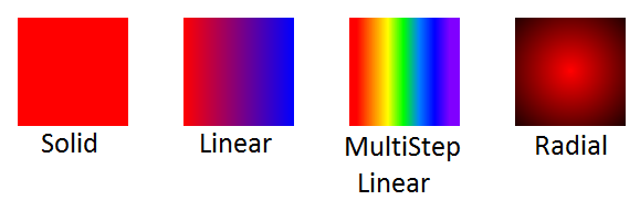
To fill elements with some color (the Fill, Stroke, and TextBackground properties) the FillPattern class is used. In particular, it is possible to use the following inheritors from it:
- SolidFill – the fill with solid color
- LinearFill – linear gradient fill from one color to another by some angle
- MultiStepLinearFill – linear gradient fill that supports the use of any number of colors with particular shifting (the Stop class is used for this purpose)
- RadialFill – radial gradient fill from some point of a shape to all its sides (similar to the MultiStepLinearFill this fill supports the Stops)
MeasureUnit
MeasureUnit is a class that stores measure units. It mainly defines in what measure units a user will input and see the units. Each MeasureUnit in addition to the name (in full and short versions) includes the Ratio that is the ratio between the cusrrent measure unit and a pixel (a pixel is the default measure unit). The following standard measure units are supported (their list can be obtained through the MeasureUnit.AllUnits):
- Millimeter
- Centimeter
- Inch
- Pixel (DefaultUnit)
- Point
- Picas
Besides, the class has static supporting methods: ByShortName, ByName, ConvertTo. To change the MeasureUnit for a particular page it is needed to write the following code:
DrawingGeometry
To draw complex geometric shapes the IDrawingContext has the DrawGeometry method that takes the special DrawingGeometry object. It has the following inheritors:
- DrawingRectangleGeometry – a rectangle
- DrawingEllipseGeometry – an ellipse
- DrawingLineGeometry – a line
- DrawingGeometryGroup – a grouping of several DrawingGeometry objects
- DrawingPathGeometry – drawing of complex geometrical boundaries
Special attention should be paid to the DrawingPathGeometry class. It is possible to set the following properties for it: IsFilled, IsClosed, StartPoint, and then set the ordered sequence of elements – the DrawingSegment, that will define boundary of the drawing geometric shape. To simply work with segments the class has the following methods: AddLine, AddPolyLine, AddArc, AddQuadraticBezier, AddCubicBezier. To form geometry of a rectangle you can take advantage the static method called CreatePolygonPath. Below is an example of cylinder drawing:
{
double ry = AbsoluteRadiusY;
double w = Size.X;
double h = Size.Y;
double rx = w / 2;
Vector2D r = new Vector2D(rx, ry);
var p = new[]
{
new Vector2D(0, ry),
new Vector2D(0, h - ry),
new Vector2D(w , h - ry),
new Vector2D(w , ry),
};
DrawingPathGeometry path = new DrawingPathGeometry { StartPoint = p[0] };
path.AddLine(p[1]);
path.AddArc(r, 180, 1, 0, p[2]);
path.AddLine(p[3]);
path.AddArc(r, 180, 1, 0, p[0]);
path.AddArc(r, 180, 0, 0, p[3]);
path.AddArc(r, 180, 0, 1, p[0]);
this.DrawGeometry(context, path);
}
Styles and Themes
The component has an ability not only to set all properties of shapes directly, but also set some style using a special property from which all the properties which are not set will be taken. The StyleName property is intended for this. A set of styles with different names make a theme. The current theme is stored in the DocumentModel.Document.Theme. The DesignerModel.Themes includes a list of standard themes:
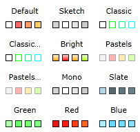
The main styles of a theme have the following names: “Node 1″, …, “Node 8″. By default, all elements have the “Normal” style (that is why it is not necessary to set all properties for all objects – all the properties which are not set will be taken from a style). Names of more complex styles can be obtained from constants of the ThemeBuilder class. This class also has the Build() method using which it is possible to build a custom theme by setting just some parameters of generation. A style stores the following properties:
- Stroke
- StrokePattern
- StrokeWidth
- Fill
- FontFamily
- FontSize
- IsItalic
- IsBold
- TextFill
- TextBackground
- StartCap
- EndCap
- CornerRadius
- IsConnectionStyle
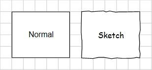
- IsSketch
One of the most interesting ones among them is the IsSketch property. It defines not just some particular properties of the objects such as color or rounding size but allows redefine the drawing process of all objects to style them in the “freehand drawing” manner.
A style for an element can be changed any moment just with one line of code:
SVG Import
New shapes can be built based on SVG descriptions thus embedding not only bitmap but also vector images into a diagram. To display SVG objects there is a special class – SvgPresenter that can parse SVG text and draw the corresponding image through the IDrawingContext. You should not worry about the performance: SvgPresenter has a special caching algorithm that ensures high performance and parsing is performed just once. The values for the unset properties of the svg file objects are taken from the SvgPresenter properties: DefaultFill, DefaultStroke, DefaultStrokePattern, DefaultStrokeWidth, DefaultFontFamily, DefaultFontSize, DefaultIsBold, DefaultIsItalic. Thus, you can change a little bit the parameters of svg image (for example, the background) directly in the designer. The use of SvgPresenter is very simple:
// ...
presenter.Draw(context, SvgText);
Unfortunately, currently the class does not support all svg tags, but most part of often used objects is handled correctly. Here is the list of some supported tags: rect, circle, ellipse, line, polygon, polyline, path, image, text, use, g, defs, linearGradient, radialGradient, stop. Here is the list of some supported properties: cx, cy, d, fill, font-family, font-size, font-style, font-weight, fx, fy, height, id, offset, opacity, points, r, stop-color, stroke, stroke-width, text-anchor, transform, width, x1, x2, xlink:href, y1, y2 . Besides that, the component supports the embedded images, various aspects of the d property description in the path tag, transformations (translate, rotate, scale, skewx, skewy, matrix), different measure units (that are taken from the collection os units in the MeasureUnit). As a result, you can get a complex vector image which can be zoomed in and out keeping the quality:
