Saying that reports aren’t always eye catchy is a bit of an understatement. Sometimes they’re just dull and dreary pieces of writing, boring data spread across columns and rows. Those who don’t need it, escape to the next page.
But what if you want more than a mere glimpse from a hasty reader? What if you want to propel the ideas behind the data? Emphasize its importance?
Then a table is not enough – you need widgets.
Problem statement
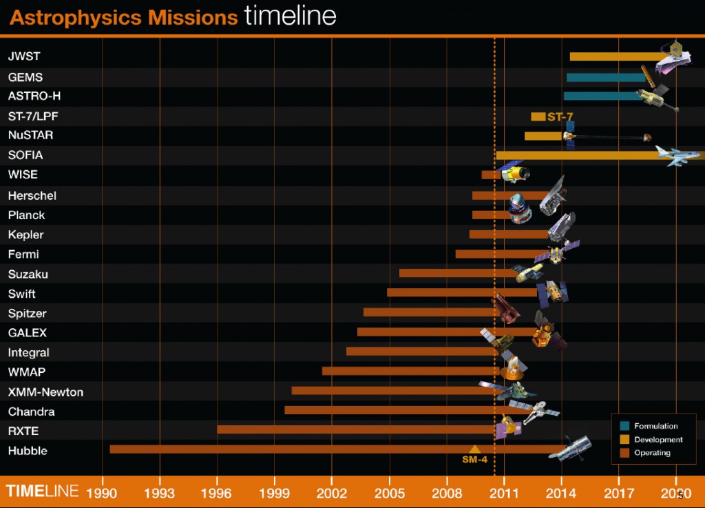
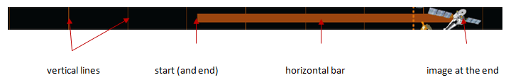
In this post I’ll show a publicly available report and explain how to re-create it with Sharp-Shooter. So here goes our poster child: a NASA plot that reveals a rapid decline in the number of astrophysics missions. The dotted line means “today”, and it’s evident that the plethora of space observatories we’ve been enjoying lately, is pretty much going to stop by 2014:
Why re-creating this very report? First off, it’s interesting data about something that concerns your humble correspondent ![]() Secondly, it’s a challenging task to do in Sharp-Shooter. While building this plot, we’d have to solve several problems, e.g.:
Secondly, it’s a challenging task to do in Sharp-Shooter. While building this plot, we’d have to solve several problems, e.g.:
- How to display composite headers and footers?
- How to use bindings in Instrument Designer?
- How to display and position images?
- ..and a few others
Below go step by step instructions on creating the above report in Sharp-Shooter, and you can also go ahead and download the full solution here.
Solution, step 1 of 2: preparing the report
Let’s put aside data generation and just assume there’s some data source NasaMissions, which contains all the data we need – and concentrate on the look-and-feel of the report.
As we can see, NASA plot is naturally divided into 3 parts:
- Header with two-styled text.
- Main part with mission name on the left hand side and a widget on the right hand side.
- Footer with the timescale.
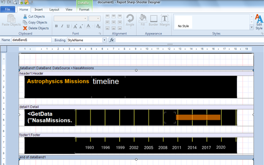
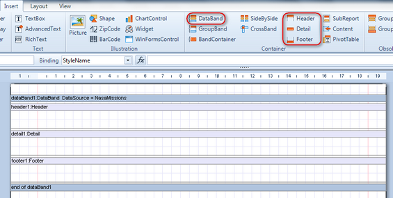
We would start by adding a DataBand and setting its DataSource property to NasaMissions. This data band will become a container for report elements. Then, inside the data band we add Header component for the header, Detail component to show individual space missions, and Footer component to hold the ruler with years. After that, the report template will look like on the picture below (necessary buttons highlighted):
What’s next? Creating content for the header and footer is easy so I’m leaving as an exercise to you, and instead will describe how to create the main section, where we display mission name and its individual timeline.
That work will be done in detail1 component.
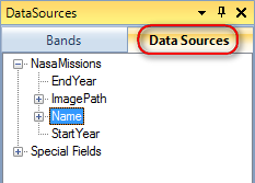
- The mission name part is rather straightforward: open “Data Sources” window, activate the “Data Sources” option, highlight Name and drag-n-drop it on the “Detail” section of the report.
- Individual timelines will be created as a widget. First off, using the button
 on the “Insert” tab, we put a widget on the detail1 component. Then resize it as we like and double click on the widget to kick off Instrument Designer: everything interesting will happen there.
Solution, step 2 of 2: creating the widget
Once you start off Instrument Designer, you’re presented with an option to choose one of the predefined widgets. It might be a good idea to go through all of them and find the best fit, because it’s just easier to adjust something that already exists, rather than starting off from scratch.
In our widget we should do a number of things:
Let’s start with the predefined „Horizontal Interval Slider 1“ widget, which vaguely resembles our end result:
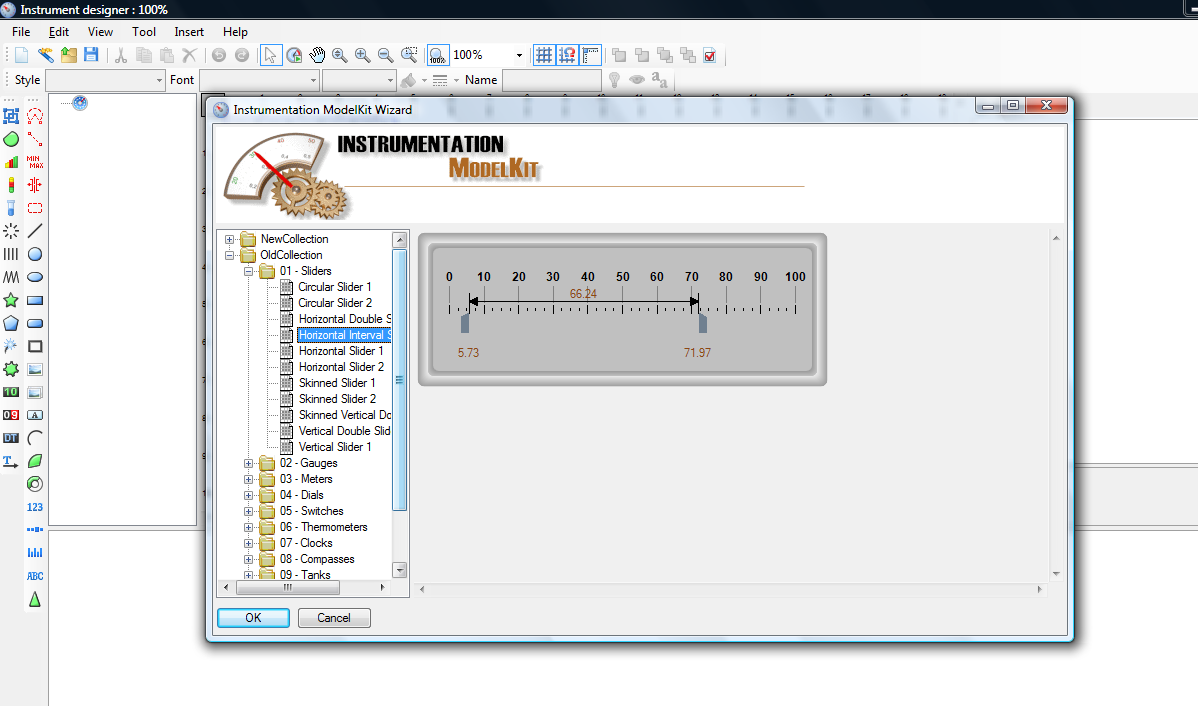
Once you click OK, the designer will present you a number of sections:
- Preview of the widget in the center. Useful if you want to know how your widget looks like

- Widget structure on the left hand side. It’s often easier to navigate between the elements via this tree, rather than by clicking on them directly on the preview.
- Element properties on the right hand side. Changing color, size, position and umpteen of other options available.
- Data bindings at the bottom. Indispensable for dynamic properties – with them, you can, e.g., always display an element centered, or make its size relative to widget size, etc.
So, now we need to update the predefined widget: delete most of the elements, change color schema, introduce a scale with long ticks, turn the middle line into a horizontal bar, add a picture placeholder and do a bunch of other tweaks. Similar work should be done on the footer widget, which will display the timescale with years.
Nothing of that is particularly complicated, but I’d like to make a few quite general recommendations:
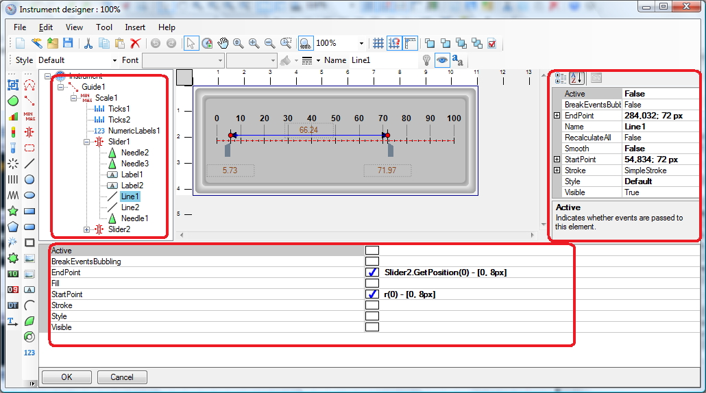
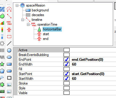
- Name the report items based on their meaning, not on their type. So, „spaceMission“ is better than „Instrument1“ and „timeline“ is better than „scale1“. It’s just easier to maintain a report with aptly named elements.
- Use data binding to set dimentions of elements relative to those of their containers. With relative dimentions, resizing the widget will not mangle its view.
An example of both suggestions is on the picture: elements are named to emphasize their meaning, and horizontal bar position is bound to the values of „start“ and „end“ scales.
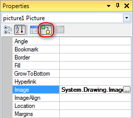
- To display an image on the widget you need to switch the right hand side view from Properties to Bindings by clicking on the corresponding icon. Then you’ll be able to set Image binding value, in our case it will be System.Drawing.Image.FromFile((string)GetData(“NasaMissions.ImagePath”)).
- To position an image you need a script. Scripts can be written in any .NET language (but make sure the report has its „Script Language“ property set to the language you plan to use) and writing scripts is a topic in itself, so for now I’d just share the resulting C# code for our scenario. This code should be put into GenerateScript property of the image element:missionPicture.Location = new System.Drawing.PointF((float)800 +
(float)((int)dataBand1["EndYear"] – 1990)*40, (float) missionPicture.Location.Y));
Once you’re done in Instrument Designer, you need to apply the widget to the report template (and you might want to save the widget into .imk file for later use). Important note: to apply the widget to the report, you should click on the hard-to-notice OK button at the bottom of Instrument Designer. Otherwise you might waste quite some time wondering why all your changes are gone!
Summary
That’s pretty much it. We have gone through creating a custom widget in Report Sharp-Shooter, learned the basic report structure, got familiar with Instrument Designer and touched the issue of displaying and positioning images. The full code sample can be downloaded here.
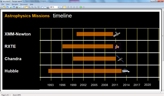
Below you can see the final template and the resulting report: