A chart in a report can convey information a lot better than a boring table, yet it probably requires some presentation skills to find the appropriate layout. One of the problems is, you cannot really exhibit too much detail on a chart without making it feel overwhelming. Which is why usual business diagrams have two axes and present data in {x, f(x)} fashion.
So what if you need to emphasize some other effect on an old-school graphics? Bubble chart comes to rescue! Enjoy one on the plot below: Google Public Data Explorer depicting a relationship between fertility rate and life expectancy. Nothing fancy, but each bubble itself also represents the population – the smaller the bubble, the fewer people live in the country.
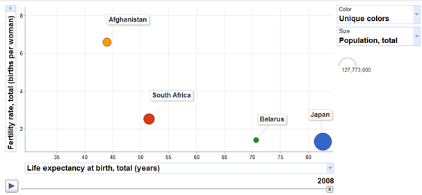
Aha, I hear you say, Report Sharp-Shooter is touted as a great reporting tool and all that, can it do the same for me please? You bet. Download the solution here and join me below on a fascinating step-by-step guided tour about creating bubble charts in Sharp-Shooter.
Step 1 of 2. Visual Studio side: preparing the data.
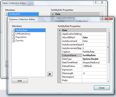
Let’s kick off a new WinForms application in Visual Studio. In this example, we’ll be using use DataTable as our data source, and so we drag-n-drop a DataSet onto the form, and fill it up with a DataTable of four columns: FertilityRate, LifeExpectancy, Population and Country. Just for reference, below is a screenshot of DataSet Editor at that point:
Now let’s set up report manager. We drag-n-drop ReportManager user control onto the form (step 1 on the screenshot below), and then create an inline report slot within the report manager (step 2 on the screenshot below):
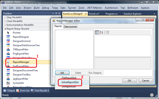
Well, “report slot” might sound scary, however it’s nothing but static data about the report layout, as opposed to real data which is passed over at runtime. To create one, you normally would double-click on the report manager to bring up its editor, and then click the Add button to set up a report slot, as on the screenshot above.
So far so good. We have a DataTable (without data yet) and a report slot, now time is ripe to bind them together, providing a name by which our report will know the data source it is using. On the screenshot above there’s “ReportManager editor” dialog where you can see a tab called “Data sources” – that’s where the binding happens. Just navigate over to the tab, hit Add button, select C# data source and give it a name which will be used in the report. Easy-peasy!
Next step is creating the data (I’m taking the values from Google Public Data Explorer):
        private void LoadData()
        {
            var rows = fertilityInfoTable.Rows;

            //fertility, life expectancy, population, country (same order as in the designer)
            rows.Add(6.6,  43.95, 29021099,  "Afganistan");
            rows.Add(2.54, 51.48, 48687000,  "South Africa");
            rows.Add(1.42, 70.63, 9680850,   "Belarus");
            rows.Add(1.34, 82.59, 127704000, "Japan");
        }
And the last missing step is allowing the application to preview the report. To this end, we’ll drop a button on the form, with the following OnClick handler:
        private void btnPreview_Click(object sender, EventArgs e)
        {
            reportSlot.Prepare();
        }
This might need some explanation. Because of the asynchronous nature of Sharp-Shooter, technically it’s not correct to say that the report is being displayed in the method above. Here we only start the async process of preparing the report, and when that’s done then a special handler gets called. So now we need two things: subscribe to the “report generation completed” event, and implement what we want to happen when the event is fired.
You’d normally do it something like this:
        private void Form1_Load(object sender, EventArgs e)
        {
            LoadData();
            reportSlot.RenderCompleted += PreviewReport;
        }

        private void PreviewReport(object sender, EventArgs e)
        {
            using (var form = new PreviewForm((IReportSource)sender)) {
                form.WindowState = FormWindowState.Maximized;
                form.ShowDialog(this);
            }
        }
As for PreviewReport implementation, here we just show a full-screen dialog with the report, but it’s not the only option available: we could have saved the report, or emailed it, or exported to PDF, etc.
So, Visual Studio part is fully done and let’s move over to the Sharp-Shooter part, where the next rife vein of undiscovered fun lay buried!
Step 2 of 2. Sharp-Shooter side: designing the chart.
I lied, Visual Studio part is not fully done. To design a report, one small step is missing: run Report Designer. While still in VS, we double-click on the report manager to bring up “ReportManager editor” dialog, and then double-click on the report slot (or select it, and hit Run Designer at the bottom of the dialog). Report designer application gets launched, and now Visual Studio part is truly over. Phew.
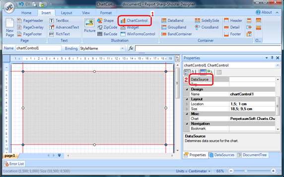
So welcome to Report Designer! Hit Ctrl+N to create a new report, select ChartControl from the ribbon and place it on the report (step 1 on the screenshot below, note that drag-n-drop doesn’t work: you’ll need to click on the control icon and then click again on the report sheet). Once you have the chart positioned nicely, select the data source for it (step 2 on the screenshot below):
Now double-click on the chart, to launch “Chart ModelKit Designer” and get ready for the most interesting part. The complexity of this designer and the amount of things you can do there is staggering, but good news is that we can build our charts on top of the existing ones, shipped with the designer. For our bubble chart, NewCollection\Points\ChartSparkleBlack diagram seems like a good candidate, and the screenshot below will be very similar to what you’ll see after you have selected that guy:
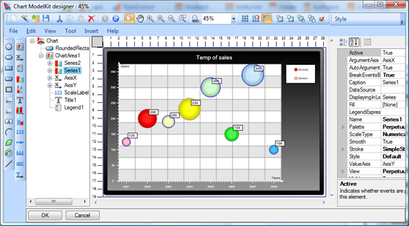
At this point, it might be a good idea to “Save-As” the chart as a .cmk file next to your report file, for convenience and to make sure you won’t overwrite the original version of the chart!
Apparently our template needs some minor changes: it uses two series of data while we use only one, and elements have generic names like roundRectangle1 and AxisX which makes the chart difficult to maintain. Once we remove the second series and give more meaningful names to the chart components, we can move on to setting up the data source for our series.
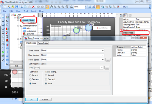
Because we’re using a predefined template, the “Data Source properties” dialog contains some fake data under “Series Points” tab, and once that is removed we can deal with data source itself. We select our “FertilityInfo” data source from the dropdown above, “Country” from the series splitter dropdown, and specify the details on the right hand side:
- LifeExpectancy into “Argument” field, because we want this to be our X axis data
- Population into “Radius” field, to have each bubble size representing the country’s population
- FertilityRate into “Value” field, because we want this to be out Y axis data
- Country into “UserData” field, because we want countries to be displayed in the chart legend
And once the above is done, if we run our WinForms application and click Preview, we’ll see this:
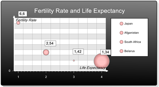
Hmm. Well, if you’re optimistic, “Aha, we’re nearly done!” is probably what you’ll say after looking at the generated report. Scales on the axes seem wrong, so we fix them. Value labels seem to be displayed too far away from the bubbles – so we alter that by changing Shift property to something like (20px, -15px). And the main thing left is giving distinct colors to each country – which is a pretty nasty piece of a problem I couldn’t solve until Vitaly Korney bailed me out ![]() So, the steps to give a unique color to each bubble on the chart:
So, the steps to give a unique color to each bubble on the chart:
- In chartView, set Palette to something (say, “Contrast” – I find this schema most readable)
- In series, unset Palette
- In series, unset View and set it back to PointSeriesView
- I have no idea why this should be so complicated, given that unique colors for each element will be the most popular request, after “same colors for each element”
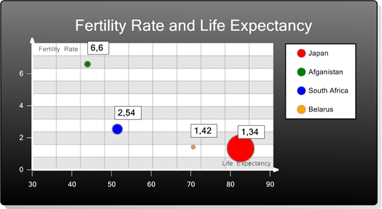
However, after the above changes, sizes of individual bubbles will go crazy and we’d need to restrict the maximum size for a bubble. To do that, we expand View property for the series, and set MaxRadius to 5% instead of Auto. And then enjoy the final result:
Wrapping it up.
In this small post, we’ve gone through creating a bubble chart in Perpetuum Sharp-Shooter (VS2010 project is here for download). We faced a few problems while implementing a solution, and were able to successfully overcome them.
R.S.S. again proved itself like a decent reporting tool to build eye-candy reports for happy customers ![]()