Recently, we’ve ported quite big business application – designer for diagrams, flowcharts and other business graphics – that we originally designed to work on Silverlight, to Windows Runtime and successfully published it in Windows 8 Store. While doing this we also developed a library of controls for Windows Runtime including features that lack in standard SDK. Now we are ready to share our knowledge and experience.
From technical point of view it was amazingly easy to port the application. Though we had to resolve some issues with API compatibility, that we hope to describe in future posts, main part of C# code and XAML markup required only very simple modifications such as renaming namespaces and some class members.
The main problem was redesign of user interface in Microsoft Design Language style (previously known as Windows Store UI, previously known as Modern UI, previously known as Metro UI). Addressing to Microsoft Design Language (previously known as Windows Store UI, previously known as Modern UI, previously known as Metro UI – Microsoft, get wise to name technologies properly from the first time) is an obligatory requirement to certify the application to be included in the store and decency standard non-compliance with which will result in application that is alien, non-native and weird to the users.
If you reviewed information and presentations explaining principles of new UI design you, probably, noticed that all samples describe end user applications intended for content consumption that have quite simple user interface. That is why if you develop Line-Of-Business application you are left face to face with half-baked guidelines declaring very nice principles such as “Always put content before chrome” that are not so obvious for developers as it comes to implementing them in real life.
In this article, we will try to demonstrate by the sample of our application some design tips we got while migrating to a new platform.
Content Before Chrome
As I mentioned, main principle of Microsoft Design Language is “Always put content before chrome”. Your application should allow a user to focus exclusively on the content he works with and make control elements not to distract from the content. In our designer, we decided to divert the whole screen to display the document and show control elements only when necessary, in context.
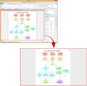
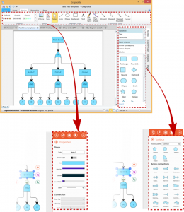
Just look, much more space is left for work with the document. This is extremely valuable when you work on a tablet which screen is physically small.
Editing graphical primitives
One more essential principle of the new UI is “Design for a touch-first experience”. This means “design all elements to conveniently tap with fingers, so mouse pointer will be able to hit the controls somehow“. Naturally, it results in some limitations. The following limitations seemed to be most vital for our visual designer.
1) Interactive elements should be just bigger to compensate less accuracy of the touch interface as compared with mouse.
2) No highlight mode. While it was possible to show control elements when mouse pointer hovered over the element in classic interface, in touch interface, it is necessary to tap the object. You can’t also use cursor shape to hint the user about interaction type since there is no cursor in touch interface.
3) Mouse pointer functionality can be significantly extended by pressed Ctrl-Shift-Alt. New paradigm requires the use of a separate control element for every action.
4) Fingers don’t only have a wheel, but the right button as well. Instead, it is possible to touch the screen with several fingers simultaneously – multi-touch.
This is how a set of control elements of the selected element changed after moving to a new version:
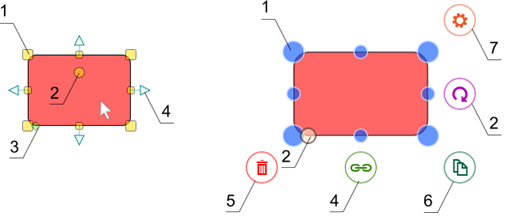
Elements 1,2,3 managing size, angle and geometric properties of the selected element became bigger
Element 4, serving to connect elements previously appearing for the hovered object is now related only to the selected element
Element 5 deletes the selected element. On the desktop, it’s just necessary to press “Del” button
Element 6 moves element copy. In the desktop application, it’s just enough to drag the element with pressed Ctrl.
Element 7 launches context radial menu. This is analogue of the right button in the desktop version.
Navigation and work with the documents
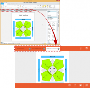
Navigation between the equal elements in Windows 8 such as open documents should be located on the upper AppBar. AppBars are horizontal controls appearing on the screen when a user swipes from the screen top or bottom or upon right-click of a mouse.
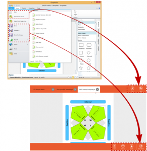
Document manipulation commands should be also located on the AppBar, on the right:
Context actions
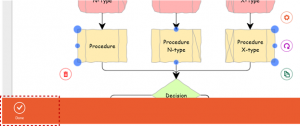
Some commands executed over the selected elements in context can also be located on the bottom AppBar. Note that context commands should be located on the left and AppBar should pop up when the command becomes relevant, for example when an object of the corresponding type is selected.
Our application uses such a solution to manage selection of multiple objects. In desktop version, to select multiple objects it’s just necessary to hold down Shift button, but keyboard may be unavailable in the tablet version. That is why selection of multiple objects required special mode. To discontinue this mode context AppBar is used.
Radial menu
The most interesting of new elements is radial menu. This is an original substitute of the classic context menu; it is used in Microsoft OneNote and looks like this:
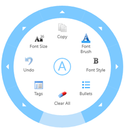
Besides the commands, it is possible to add quite complicated controls such as slider or color picker to the nested menus.
Obvious advantages of the element is unusual attractive design and minimal distance from current position of the cursor (or finger if you work with touch screen) to each command. Besides, this element can contain no more than 8 commands on a single level which makes user interface designer avoid overloaded menus and develop end user interaction more carefully. And psychologists know that the mind works effectively with no more than 7-9 elements simultaneously.
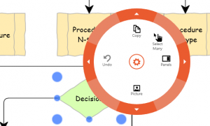
Unfortunately, this control element lacks in the standard library and we had to design it by ourselves.
It replaced all classic context menus and got some commands from the ribbon.
Flyouts
All other control elements were placed on the flyout located on the right of the screen:
Сharms
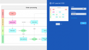
Some actions such as setting window or print should be implemented in a new interface with Charms Bar that runs upon swipe from the right side of the screen. Practically, this is an analogue of the AppBar described above that includes actions similar for all applications and system management functions.
This is how print dialog looks like:
Summary
As you see, development of Windows Store version of the business application will require significant redesign of the user interface. Luckily, new Microsoft style – everything is so very, very square with solid fills – makes this task much easier for developers.
LOB Application reimagined for Windows 8. How we re-designed UI of the business application to port to Windows 8 Store.
Eugene Akinshin
November 22nd, 2012
No Comments »