In this article I would like to share my reflections on the usability of the Reports Designer component a novice user would experience when holding the first tryout with the product. It has turned out that not long ago I had been employed as Perpetuum technical support specialist and as Latin phrase says ‘volens nolens’ I had to do my first steps with the company’s products, and of course, the Report Designer as one of the most extensively used components had quite a number of options for me to research. To tell the truth, my first experience with this component turned out into the bunch of questions that were hard to explain on this stage of product examination, but later all my worries settled up with gradual understanding of the workflow which seems to be one of the most crucial aspects in achieving success in creating and modifying reports. To shorten the above said, I had a hunch that the component interface would provide me with a number of WYSIWYG elements which can be used in creating a report template, but in practice the things proved to be a bit more complex, yet still interesting and informative.
To start with, we will need to get the point of how each report element can be used in creating the report template to fit the requirements we impose. So let’s navigate to one of the ribbon UI tabs of Report Designer which is called an ‘Insert’ tab and have a quick look on the report elements.
By default the panel elements are greyed out, but as soon as we create a new report template (File > New > Blank C# Report) all the elements become active.
At first look we see quite familiar captions to the presented icons. TextBox, Chart, Picture, PageFooter and PageHeader….. “All is so simple”, you would say. But then we come across some controls that puzzle us to the point that we start asking ourselves – “If we have a PageHeader and a PageFooter control, so why do we need a Header and a Footer control on the right side of the panel then? What are those ‘bands’ names stand for in some of the controls captions? What’s the difference between a TextBox and an AdvancedText controls? “. Obviously, this question list can be continued. Since the point of our article is not to criticize the Perpetuumsoft component for its apparent complexity, we should dot the i’s and cross the t’s to be able to utilize the report elements the way we want them and be absolutely satisfied with a shiny look of any report we create.
Now, let’s get back to the report elements. As it turned out, all report design elements can be divided into two different types – visual and non-visual elements. The visual elements, as the name implies, becomes visible after the report is generated, while non-visual elements (such as different “Bands”) don’t have any graphical presentation in the report and serve as containers for visual elements as well as define the logical structure of data output. Since the report construction process slightly differs from WYSIWYG concept and seeing bands and elements inside them in design time would differ from what we will eventually see in the runtime, a “Preview report” button in the upper left corner of the designer comes in handy to be able to see how the rendered report will look like.
Reasonably, all elements of the “Insert” tab are divided into five groups.
![]()
1.“Page” group consists of elements used for customizing the report’s page headlines and background.
2.“Table” group is a single element group for adding tables to a report.
3.“Text” group contains a number of text controls.
4.“Illustration” group provides controls for customizing a report with miscellaneous graphical elements.
5.“Container” group includes the non-visual containers for elements of groups 2 through 5.
As an introduction how the report is created and how visual and non-visual elements interact in general, I would like you to examine the following quite an ordinary sample.
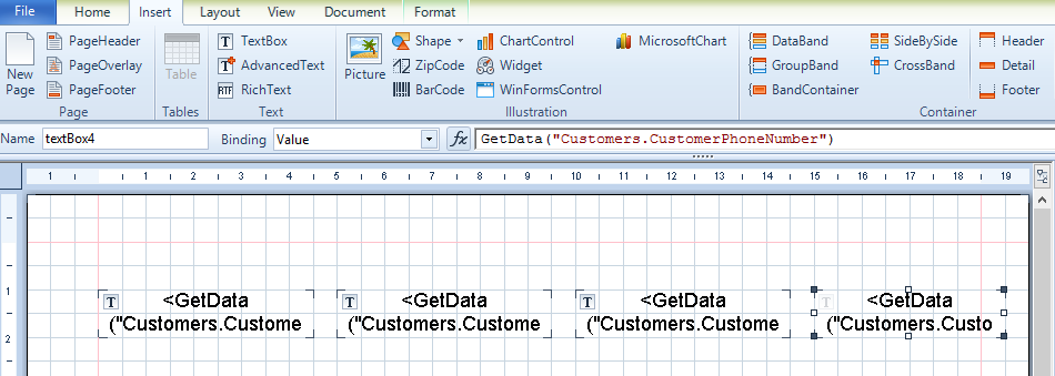
Let’s say we have some data table “Customers” that consists of the following fields – “CustomerID”, “CustomerName”, “CustomerAddress” and “CustomerPhoneNumber” and we want to display all these fields in our report. So, first, we add “Customers” table as a datasource for our report. What’s next? Well ….let’s try to add some textboxes to our report so we can display the data from our source table. We’ll do it like this:
After we bound scripts to each of our textboxes (this is very simple as scripts can be added automatically from Script editor with the help of drag-and-drop function), we can preview the result.
As a result we can see only one row output. This is different from what we expected. It appears we need some control that can iterate through the table records and display them. And at this point we should try some non-visual control to help us. So, let’s try the upper one called a “DataBand”.
After putting the DataBand element on report body we added our “Customers” table as a DataSource.
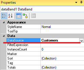
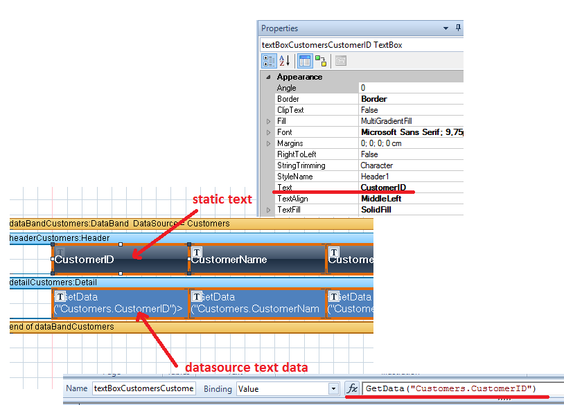
Adding textboxes to our DataBand control automatically created a Detail element inside the DataBand. Well, that’s rather convenient…

Previewing the result was a great delight.

And browsing through appearance customization styles makes room for creativity.


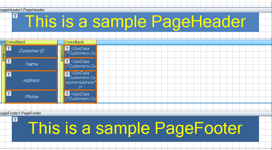
Next, I tried to reproduce the following with a “CrossBand”. After some research, I modified the report template as follows:

….and was pretty satisfied with the result, since the data rows were output in the horizontal direction as I was expecting.

Of course it’s possible to create quite more complex report templates, but this should be a topic for a separate article.
Summing up this, you can be sure that creating a report from scratch won’t be that difficult and mysterious as it may seem in the beginning.
Now let’s get back to the report element groups and describe the elements in detail.
As we have already mentioned a “Page” group contains elements which are used for creating top and bottom headlines of a page (Page Header and Page Footer) as well as a report background (Page Overlay). The parent element for these containers is a “Page” itself.
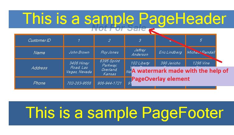
In practice in design time it looks as follows:
And in the runtime we have such result:
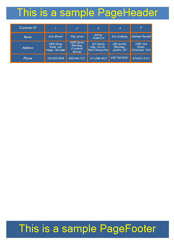
One important thing which should be remembered is that the space before and after these elements after the report is generated would be defined by the space between these elements and a top/bottom border of a band in a template.
So, after adjusting the report template like this
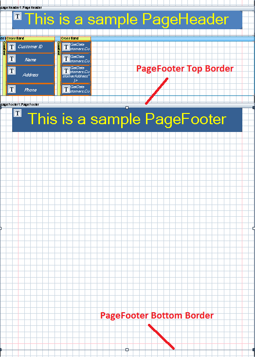
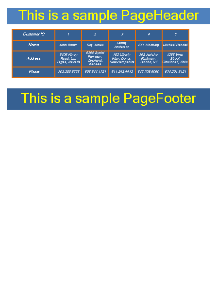
….the final result that we have in the runtime will be as shown below.
Apart from setting the report background image, a PageOverlay control can be useful for creating watermarks.
The next element that can be used when creating a report is a “Table”. A curious thing is that this element doesn’t represent a separate element as such, but instead, it utilizes the same elements a report maker uses for creating a report; those are a Databand, for connecting to a datasource and representing data in a table view, a Header, for making captions to table rows, and a Detail, for data visualization. “What’s the purpose of this, if report creation process already implies representing data in a table view and all above mentioned elements are always at hand?”, you would say.“ The answer to this would be, “A simplicity”. In case you want to create a simple report quickly, without bothering yourself with additional customizations and not taking much care about anything rather than table data, this element definitely comes in handy.
Here’s how it looks both in design and runtime.


Occasionally, I formatted the cells the way I like it, since the customization tools are available even in this fast track.
The next group of visual elements is related to text output and includes a TextBox, an Advanced Text element and an RTF TextBox.
A textbox is one of the main elements for displaying text information. The text information inside a textbox can either be static (for example, when specifying a data row caption) or generated from a datasource.
The textbox has quite a number of properties, some of them are generally obvious and include appearance customization (like font style, fill style, text alignment and so on), but some featured properties are specific (like properties in the Render group) and it would be a good idea to make an accent on this right now.
Let’s begin with the “CanGrow” property which allows increasing height of the textbox in case its contents do not fit the size specified for the textbox in template. Well, let’s see how it works. After placing the textbox on the report body and typing in the text that deliberately exceeds the text area, we can see the following picture in design and runtime after setting the “CanGrow” property to both “false” and “true” values in turn.
As for “CanShrink” property, it behaves in an opposite way and allows decreasing height of the textbox in case the content has smaller size than that set for the textbox. I will not actually try to look into this property in detail, since as far as I can see it, there are few situations when this property can be applied.
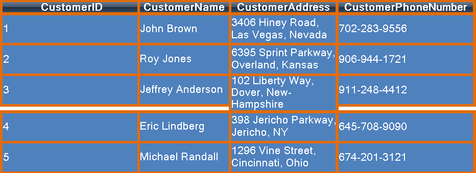
Another property, which resembles “CanGrow” in its own way, is called “GrowToBottom”. The main difference here is that it allows the object (a textbox, in our case) to stretch up to the bottom border relatively to the largest record. Let’s try to recreate the case when this property can be useful. Suppose we should reduce the width of columns in our report, so in the runtime we would most likely face such issue:
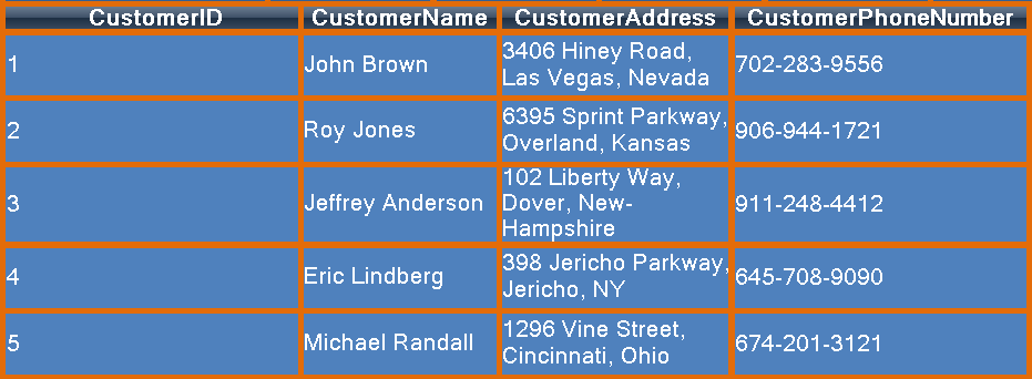
Here, the “CustomerAddress” record of customer with ID#3 is the largest record since it occupies three lines of text. As the textboxes to the right and to the left of this record are set to use the predefined textbox size values, they behave as expected leaving the blanks right under each textbox. To correct this, we should set “GrowToBottom” property to “true” for these textboxes so they can grow properly to the bottom in relation to the bottom border of the textbox with the largest record.
After such manipulation, we have our report table fixed.
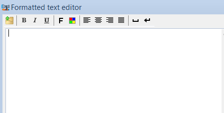
Another text element is an “Advanced Text” which looks pretty similar to a regular TextBox, but has an embedded formatted text editor which allows applying some simple text formatting.
This element is also good for situations when we have to deal with large text fragments, since the regular TextBox is not intended for such occasions.
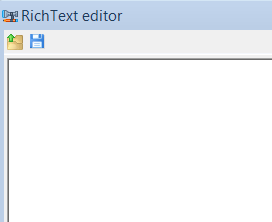
And the final element in Text group list is a “RichText”. The main idea under this is to be able to output the text information in RTF format. This element also has its own editor, which can be called by double click on the element. One of nice and pretty convenient features I found about this tool is the ability to import RTF files.
Finally, for this part of the article I’d like to say a few words about the elements of “Illustration” group. There are plenty of them. The only thing that can keep you from implementing the creativity in customizing data visualization is your imagination. Here we have a picture control which allows us to add images in most popular formats to our reports, shapes with the set of predefined geometric figures and lines, ZipCode control, BarCodes for displaying numerous barcode types, chart and widget controls for adding customized elements to a report either by creating them from scratch or by using a set of predefined templates. That’s a really large set of capabilities …. I would say, “Enormous”. Luckily, there are no particular difficulties with such controls in relation to report visual appearance customization, that’s why I would like to skip it until there is an urgent need in describing these elements in detail.
To be continued….

